
CONTACTS
Finally….
Today I had the Darkroom Printing workshop for which I`ve been waiting the entire week. It was awesome.
What you see up there are contact prints made from my Ilford Delta 100 film. These are images that I`ve been taking for the last weeks. I still have a few films to process, including an infrared one, but I chose this one for today`s session. Here`s how it all came down.
Environment – The first thing I noticed while going in is that red light is very dim. So dim that you can barely see on black surfaces (which are unfortunately everywhere on the walls). This is necessary in order to prevent paper from darkening. Fortunately there is a lot of space so I don`t feel claustrophobic.
Equipment– There are many various enlargers for both 35mm and medium format film. I noticed that 35mm enlargers tend not to cover the entire surface of the frame and so losing information. I`ll try a medium-format-sized one and maybe….some luck. The easels used to crop t
he image on the table are not so great though but with a bit of practice I`ll make it. There is everything from a guillotine to washing tubes for the paper. There is plenty of order so there`s no chance of even coming in contact with the chemicals by using gloves.
Paper – Sara Farrington, the technician, provided us with some 8′ x 10′ Ilford Multigrade RC (resin coated) paper which was very nice. I still hate the reflective surface of glossy paper so I`m definitively going with matt surfaces in the future. Also, I will go for Fiber Based (FB) papers in the future because they give a much more smooth texture and also a fresher tonal range. One of the bad things that I found out is that virtually every paper type is in 4:5 format and not 2:3, the way 35mm photos come out thus loosing surface during cutting. Another bad thing is that 8′ x 10′ isn`t that big now that I found out I need to cut the paper… The logical answer would be to go bigger but unfortunately this appears to be the threshold after which prices start to soar. This is also the point where packs start to have fewer sheets compared to the 100s that I had. I`ll have to go with this size. And there is also the problem of tone: these prints came out in neutral tone, the question is whether to go with warmtone or neutral. Unfortunately (or maybe fortunately 😀 ) wamrtone is 20 quid more so my hand if forced.
Development – After exposing the print it needs to go through 3 baths:
- developer – it accelerates the darkening process and gives us a usable image, it`s far more merciful than film developer, a stopwatch not being necessary. It`s, as most have told me, an almost magic moment when you see a faint image forming on the paper, appearing from nowhere.
- stop bath – this is a short 30-sec-bath that the paper needs to go through. It is acidic so it neutralizes the developer completely.
- fixer – here the image must spend about 4 minutes to ensure that it no longer is light-sensitive.
Finally there is a final wash in water but the prints can be seen in normal light immediately after fix.
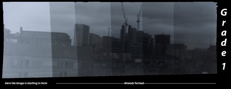
Exposure and contrast – Just like film, paper must be exposed to a certain amount of light in order to gain in density and darken. The image will appear positive as the negative of a negative if a positive. What is interesting (at least in this paper`s case) is that darkening really starts after about a second. This can be seen in the less-lengthy exposures of the test strips that I did. I assume this is caused by the law of reciprocity stating that after a set amount of time, exposures will start to have less difference, a sort of photon-saturation (also seen with film in long exposures). This isn`t a grave factor unless your frames are underexposed (like mine 😀 ) in which case there will be need of a shorter exposure time for the prints.
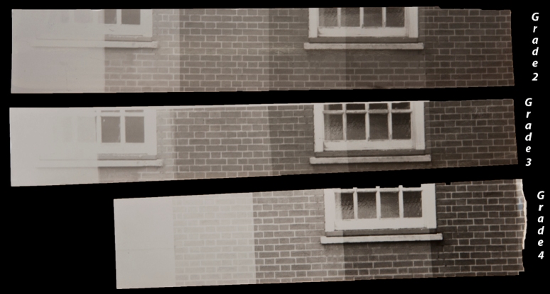
Another thing to take into account is the contrast of the image. This is probably one of the greatest advantages of working in b&w. It`s done by using filters placed in front of the negative that slightly change the color of the light (from yellow to magenta). Another way is by using a color enlarger that has color scales embedded in it`s light source so that you only flick a switch to get a certain grade. Grades are from 00 (very soft) to 5 (very punchy). The catch is that the image actually darkens with a higher grade and viceversa thus requiring a different exposure for each grade. I have decided that the best way to find out the best pair of contrast-exposure for each print is to tear an entire sheet of paper into strips, pick the most probable 4 (or by all means all) grades and do exposure tests for each. thus we`ll have an example of each combination and it will be easier to figure out what to use.
Dodging and burning – This is the process of selectively giving different areas of the print (such as the sky) different exposures in order to have an overall balanced composition. This is done by covering part of the print (dodging) and leaving the other part get more exposure (burning). Here I bumped into a problem: the times being so short (a matter of seconds) how the heck am I supposed to cover the areas that I want in time before the print is exposed???
I`ll have to check back on you with this because it`s important.
Drying – Drying is pretty straightforward, the prints needing about 20 min to dry properly. I hear that FB paper needs about an hour🙁 and that is also curls and needs about a week pressed in a book to straighten-up :)). Damn this higher quality.
All in all, the process is very meticulous, especially when cropping. I spent 3 hours, exposed about 5-6 sheets and got just one decent print and 3 other failures.
Practice makes perfect 😀.
It`s beautiful nonetheless, print is heavily underestimated amongst photographers. I can`t wait to see the scan of a good print too.
Tomorrow I`m buying my own paper and not leaving until I`ve got at least one good print so watch out 😀