Night photography part III

Experiments regarding the use of Ilford PanF+ on capturing a decent moonrise have failed. Although the moon’s intensity was comparable with the Earth’s, PanF is simply too contrasty to capture details.

I might consider resorting to HP5 in a low dilution developer or pulled down to ISO 200 for the job.

Alternatively, I could resort to post-processing by the means of printing down the sky of a dusk scenery in order to suggest the idea of night-time.

Welcome to medium format


for-blog-1

CONTACT SHEET 1

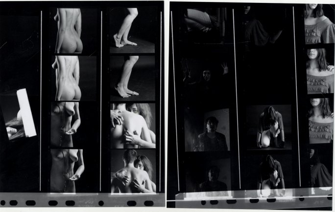
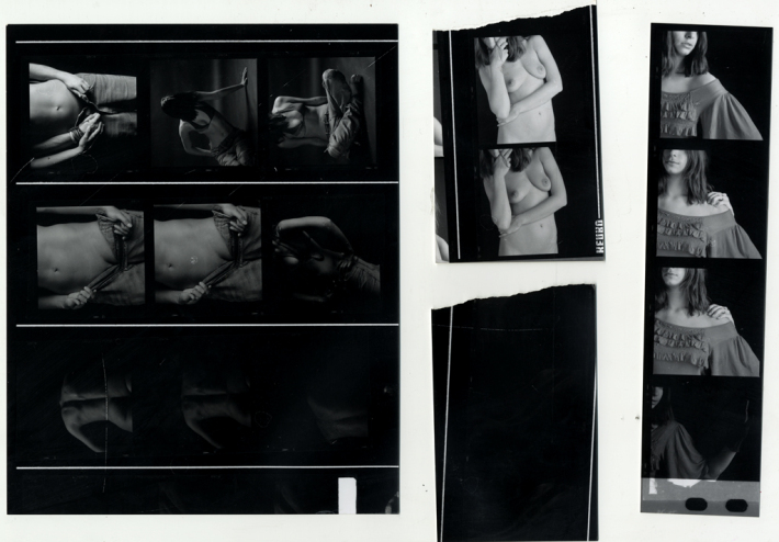
About 2 weeks ago I managed to do a studio session using the Hasselblad 503W, a medium format camera.

Unlike 35mm film, medium format is much larger in size and thus, grain, sharpness and dynamic range are all increased. The Hasselblad uses the 6×6 square ratio and gets me 12 shots per film. The film used is 120 film and I found out that almost all emulsions come in this size.

Loading the film is tricky because it is backed by a black tape, preventing exposure while not in the camera. Loading is on a spiral is even more interesting but with a bit of practice it’s about as easy as with 35mm. What’s interesting is that 120 film (at least the one that came out from my camera) has a lot of space between frames, thus allowing me to give well defined black borders during printing.

The results are significantly better than the ones with 35mm. Grey-shade transitions are much smoother and it’s hard to over or underexpose. Even with an underexposed image I could get wonderful results by slightly increasing the contrast. Sharpness is also very good, I’m guessing because of both the film and the camera w/ Carl Zeiss lenses.

I can’t help but think why people would resort to even bigger formats such as 4×5 or 8×10.

Not posting the images yet because they’re part of a larger project that will hopefully be finished by the end of term, but I will leave you with the contact sheets 😀.


for-blog-2

CONTACT SHEET 2


ITAP Lecture 8

The eighth ITAP Lecture took us through the process of Production. It defined production as the last stage of the design process, in which the found solution to a problem is put into practice.

As a first task, we were asked to find out how the first book in Europe got printed.

JOHANNES GUTENBERG

The Gutenberg Bible was the first ever boom to be printed in Europe, or anywhere in the world for that matter. Named after Johannes Gutenberg , a German printer and the one to introduce modern printing, the Bible was the first book to be printed with movable type. It is also called The-42-line Bible because of the 42 lines of text present in each page, a first at that time. However, the first 9 pages and pages 256 to 265 of the Bible have only 40 lines of text each, presumably because they were the first to be printed, before Gutenberg’s change of heart. It is unknown how many copies were sold, probably somewhere between 160 and 185.

Another innovation that the book carried was a new type of ink.

GUTENBERG BIBLE IN NEW YORK PUBLIC LIBRARY

Gutenberg used an oil-based ink, instead of the usual watercolor, containing metals such as copper, lead and even titanium. The major improvement of this new ink was in it’s much better adherence to the pages.

The Bible sold out quickly to buyers as far as Hungary. Nowadays, only 21 copies remain complete in museums and libraries around the world in cities such as Vienna, Copenhagen, Munich and Berlin.

NOVICE-TO-EXPERT SCALE

The second task consisted of a self-assesment regarding our level as visual communicators. The Novice-to-Expert scale allowed me to rate myself as Competent.

In developing the Birmingham-based magazine for the first project, I showed some good knowledge regarding my area of expertise by studying some important historical practitioners, also photographs that fitted the purpose of the magazine, though they did lack some refinement. I was able to work without supervision most of the time.

I planned ahead my part of the project by making notes in the RVJ about what could work and what remained possible but not plausible. Many of these ideas were materialized only on paper and some even in the form of images, but were saved as a later project that I might attend to.

Night photography part I

I just printed the negatives from the last night I went out with my camera.

The results aren`t so bad actually, film is definitely a great medium for long exposures. I used an Ilford PanF+ which I developed in a low dilution ID-11 (1+3). The reason why I`m doing this is because I heard it “unlocks” additional mid tones so that the film has even more information on it; in addition, the manual also says it increases sharpness. I can`t really tell this from the prints because I haven`t really got anything to compare it to since I`m so new at printing.

What I can say is that there is no sign of grain even at exposures up to 20+ minutes. Film is so much better than digital at this because it doesn`t gain noise like digital sensors do while they heat up for long exposures.

Printing some of the negatives is however, hard, because I have to dodge and burn zones that have relatively complicated zones; seems I don`t have enough fingers 😀. But when I do manage it, it`s great. Birmingham can be interesting at night, streets are nearly empty, buildings light-up and lights are kinda interesting from a photographers point of view.

The night I went I also had the luck of a clear sky and the moon rising over. I used this great calculator that tells me where the moon is going to appear and when. Planning is indeed important when you plan to photograph the night sky. I tried putting the moon in context with the city by photographing it next to a building but I immediately stumbled on a problem:

  • the moon is so bright, especially during full moon, that anything else you try to put in the frame will appear black. It`s something like 1/60 at f5.6 on ISO 50. Even if I try to overexpose the moon and burn the sucker later in printing, I would eventually go beyond the capabilities of the film in terms of exposure latitude. It`s funny how photography can sometimes be full of technical difficulties.
  • the good news is that I only need a 200mm lens on 35mm format in order to have a decent image where the moon is easily visible. this means that I can still have some landscape there and don`t need to haul fast lenses either (my Nikkor 70-210 f/4 manual focus is more than able to do the job).

The only solution to this problem is trying to photograph the moon exactly as it rises. I noticed that sometimes, a moonrise is very subtle, the moon is a pale yellow-orange, the same as sodium street lamps and is not very bright, we don`t even notice it. What does this mean? It means it`s my best chance. The moon`s brightness will be closer to the city`s so I may, with some very nasty dodging and burning, be able to get a decent pictures.

Another thing that I haven`t tried is using a different film. Both PanF+ and HP5+ for example can be pulled one stop in development for lower contrast but PanF+ at ISO 25 is a bit to slow for the moon. And besides, I don`t think that lower contrast really means a bigger exposure latitude. It`s worth trying though.

The next full moon is on December 10, so expect a part II of this post sometime around Christmas 😀.

ITAP Lecture 7

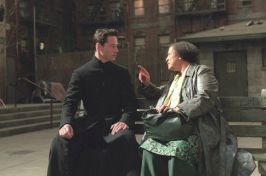
ITAP Lecture 7 was about Ideas and Structure in Moving Image. Due to the subject, I was naturally more enthusiastic to do the critical commentary especially because I get to do it on one of my favorite films. Thus I will discuss in detail two of the 5 key principles and I will base both of them on the 1999-movie The Matrix.

The first principle discussed was Story Development. Like every story, fairytale of novel, a movie’s plot must have a beginning, a middle and an end (“although not necessarily in that order”).

Released in `99, The Matrix was a successful science-fiction movie directed by Larry and Andy Wachowsky. It starred Keanu Reeves and was also the beginning of a trilogy. It explored the new and original idea of the whole world being actually a “computer-generated dreamworld”. This world is controlled by a race of machines that draw their power from humans. The hero of this trilogy is Neo, initially himself a captive of the Matrix, but later becoming a savior for the human race.

The three acts (beginning, middle, end) are clearly divided in the storyline.

The beginning goes from the minute we see Trinity attacked by agents (a scene introducing us to the unusual nature of the Matrix), it presents Neo in his natural world and also his conversations with Morpheus, the captain of the and member of the human resistance against the machines. These lead him directly into agent-hands which question him and place him with a homing device in order to track down Morpheus. The beginning ends when Neo meets Morpheus and is unplugged from the Matrix.

The middle of the story consists of Neo meeting the Nabucodonoso`s crew, finding out the truth about the real world and learning new skills in order to defend from agents. The middle also contains the trigger for the end: one of the ships crew, Cypher, defects and makes a deal with the agents offering Morpheus in exchange for his body to be reinserted into the Matrix. This deals takes places as Neo and the crew seek the Oracle, an all-knowing matrix program meant to lead them the right way. The pass into the end is made when Neo and the others realize that they are trapped and Morpheus Sacrifices himself in order for Neo to escape.

The end is when Neo risks his life to save Morpheus from the agents. He is also confronted with Smith, an agent of the system and initially is defeated but then is revived and we see him taking hold of his role as “The One”.

NEO IS NOW MASTER OF THE MATRIX, BEING ABLE TO SEE IT`S PROGRAMMING

Another key principles that was discussed was The hero`s journey. This was based on the monomyth, a pattern developed by Joseph Cambell, describing the stages a hero goes through the story. Neo follows the same stages. He is initially a captive of the Matrix but with the help of Morpheus and his crew he leaps into the real world, achieving supernatural powers and then returning to the Matrix in order to free his fellow humans.

In the hero departure he is subject to:

  • the call to adventure – he is contacted by Trinity that tells him of his captivity and invites him to find out what the Matrix is
  • supernatural aid – Morpheus calls Neo and instructs him how to escape the agents following him
  • belly of the whale – despite Morpehus’s help, Neo is captured and interrogated by the agents
  • crossing the first threshold – Neo is unplugged from the Matrix and wakes up in the real world, 200 years later than the time he though he was in.

The hero is also subject to initiation:

NEO ACHIEVES NEW SKILLS THAT ENABLE HIM TO CONTROL THE MATRIX

  • road of trials – Neo learns new skills to fight the agents, confronts Morpheus in a duel and also fails the last trial
  • meeting with the goddess – in this case Trinity, Neo falls in love with her and further in the series saves her life at the risk of his own.
  • temptation – in the first sequel Neo meets with the Oracle again but fears that his choice of following the path of the one may lead to Trinity`s death.
  • atonement with the father – also the first sequel, Neo meets the architect, “the father of the matrix”, and finds out about his true origins and path. This is also where “the path of the one ends”
  • apostasis – right before the end of the first film, Neo is killed by Smith. He is revived however by Trinity`s love and returns to life
  • the ultimate boon – after his revival, Neo becomes master of the Matrix and defeats Smith, also proving that he is the one.
  • refusal of return – in the second movie, after unplugging countless people from the matrix, Neo is reluctant to take his place as a savior in the real world.

NEO IS SUSPICIOUS OF THE ORACLE HELPING HIM BECAUSE OF HER TIES TO THE SYSTEM

The final part of the hero`s journey is the return:

  • magic flight – in the second movie Neo and his crew are flown back to Zion, the last human city, with the Nabocodonosor, a high-tech hover craft.
  • crossing the return threshold – unlike other movies, in The Matrix trilogy this happens before the rescue from without. In the last film, Neo attempts to control the sentinels from the real world via his mind and succeeds but is thrown into a place between the matrix and the machine world where he is the captive of The Merovingian, a powerful and evil matrix program.
  • rescue from without – Trinity and Morpheus risk their lives confronting The Merovingian and thereby rescuing Neo from his captivity.
  • master of two worlds – in the final part of the trilogy, Neo achieved powers over both the Matrix and the real world. He is now able to control both worls.
  • freedom to live – in the very end, Neo sacrifices himself being defeated by Smith (now also revived to be more powerful and attempting to control both worlds as Neo does) and infects him with a virus from the machine world, with whom he made a deal in order for Zion to live. The human city remains standing and most of the Matrix inhabitants are freed.

Pinhole project

I`m starting a new project this winter. As you can see in the title, it`s about pinhole photography.

I`ll leave an 8x10in sheet of Ilford MG FB paper in a shoe box stuck on my dorm window for the time I`m in Romania. That means about 3 weeks of exposure. The scene won`t be very interesting (just the street in front of my house) but I should be able to see the sun as it passes by each day so I`ll have a bit of Solargraphy as well 😀.

I hope the paper will be sufficiently exposed so that the image will appear without any dip in developer. I happened with a sheet of paper somebody left in the darkroom. It eventually started to darken after a few days. Unlike developing, this give a more smooth appearance and a sort of analogue HDR look.

Depending of the results I get now, I plan (on the very very long term) to have several such boxes around both Birmingham and Bucharest. I`ll label each with the date they were placed and pick them up later on after days….months….years :)). I even want to place one at my former high-school that sees the courtyard. Should be interesting, I`d have “eyes all over” >:). I probably will forget about it until I find the notebook in which I wrote it down.

ITAP Lecture 6

Production and Outcomes was the subject for our sixth ITAP lecture last week. It described in detail ways of optimizing both the production stage and the outcome form of our design process. This included 5 key principles, of which I will describe two by using examples from the photographic industry.

Interpretation is the means by which each creative uses, more or less consciously, the zeitgeist of their time in order to give a certain feel to their work that is appropriate to the time and place they are in. The zeitgeist it the sum of all the characteristics specific to a certain timeline and place, as brought by art, literature and religion. This greatly influences the work of contemporary artists and can also show slight differences between the same idea but re-worked in a different timeline.

HOKUSAI – SUDDEN GUST OF WIND

For example, there is Hokusai`s “Sudden Gust of Wind”, a 19th-century-painting that illustrates the effect of an upcoming typhoon. Signs can be found in the form of bent trees, characters that seem panicked. This was the effect of the zeitgeist on Hokusai. Living in Japan meant experiencing dozens of such events that ultimately led him to inspiration. However, there are some distinctive features such as the simplistic line in the background, forming the shape of a mountain, something characteristic to Hokusai`s time and style and also the dynamics caused by the impression of wind carrying things in the air.

Jeff Wall - Sudden gust of Wind

JEFF WALL – SUDDEN GUST OF WIND

A few centuries later, in 1993, Jeff Wall decides to reproduce Hokusai`s painting in his own way. Although not a painter,

photographer Jeff Wall took more than 50 images in order to construct the final photo. Being a `90 Canadian photographer, he placed his scene in Vancouver and had the image printed on Cibachrome. The same elements are there, dynamism created by wind, the trees bent, strong sign of a powerful storm coming, but there are certain aspects unique for Wall`s time and place such as the characters of the image and also electrical pols in the background.

Another relevant principle for this subject is Delivery. It refers to the ways a creative uses his work and the platforms that the work may lay on. These include editorial work, advertising, publishing and others.

An example of photographer using several platforms is Ansel Adams. He became so widely popular in the 20th-Century United States that his photographs were being used in calendars, books, encyclopedias etc. Being a convinced environmentalist, Ansel Adams would often take trips in Yosemite and the High Sierra. His photographs inspired perfection of nature and were to be included in several portfolios that he sold for thousands of dollars. He has connections with Stieglitz and Georgia O`Keeffe, also famous artists of their time.

Along with Imogen Cunningham and Edward Weston he formed Group f/64 and used it to further promote their work and the notion of “pure photography”. Although not long lived, the group provided a very different perspective on photography as an art and also provided a new and innovative way of depicting work.

In 1933 Ansel Adams opened his own photography gallery in San Francisco and began doing commercial work for different clients. These new platforms included documentary photography and also photojournalism. These easily illustrate Adams`s versatility as both a fine art printer and a journalist.
ITAP Lecture 5

For our fifth ITAP lecture, Research and The design Process were our primary subjects of interest. These include five key principles of which I will choose two and expand using examples of both my and other artists work.

Legibility, is what makes a particular thing stand out or not in any visual communication. It can be a very useful tool if the communicator wishes to enhance something in his work or disguise a subtlety. However, misuse can lead to disorientation for the viewer or missing the point all together.

I decided to illustrate this principle in photography by expressing the background-subject relationship in monochrome portraits.

IMAGE 2

IMAGE 1

The background should be an important part of any portrait because it can enhance of hide different characteristics of the subject. A dark background will direct attention to the subject and it`s light areas such as the skin. This can be useful if, for instance, one wishes to emphasize certain facial aspects but leave out things like clothing of hair. As seen in Image 1, dark or dark gray background tends to decrease contrast and give a smoother, more relaxed appearance.

On the other hand, a bright background will bring contrast to someone dressed in black clothes, such as in Image 2. This will give a strong first impression and attract any viewer to that image, regardless of what it contains. It is similar to black type on white background giving the best possible legibility. This scenario will also hide from the viewer`s sight details of the subject`s face, since the eye is at first attracted by the dark zones, these standing out the most.

Of course, bright background can also be used with a light subject, as in Image 3, to give a more subtle contour. This happens because the eye is easily confused by the slight difference in tone and doesn`t quite realize which is which. contrast is still high because the background tends to lightup the portrait and dark areas are even darker.

IMAGE 3

Another key principle is Visual Hierarchy. It`s a rather straightforward concept, illustrating the order in which a viewer sees different elements of a visual image. This can be useful is the author wishes the public to have a certain understanding of his work.

HENRI CARTIER-BRESSON 1952

Enter the darkroom part 2

Consider these as my acknowledgments after a few days of printing:

Print quality – It`s really sad to think that most people don`t get their photos on paper. It`s a very nice feeling and the Ilford FB Standard paper that I tried seems very nice. I especially enjoy the matt surface because it doesn`t reflect light, makes details easily visible and gives a soft but present contrast. Grain, to my amazement, doesn`t seem at all obvious; most of the prints that I did were from a Delta 100 ISO film (which, by the way, I`m never using again for outside shots because of it`s lack of exposure latitude) but one from an HP5+ pushed to ISO 3200 came out quite fine. I still need to work on it but I don`t see a reason why not to use high-speed film for snapshots from now on.

Washing and drying – Washing Fiber Based paper takes about 40-60 minutes. I tried drying prints on a flat surface but the curl is very obvious. I guess that`s one of the disadvantages of working with FB. I did however try and press the prints between some books and they turned out fine after a few days. Even more efficient is pressing the prints while they are still wet. I must be careful though because any water remaining on the surface will probably leave marks. My only problem regarding this thing is about scanning but hopefully it should work fine.

Cropping and bordering – I found out that 35mm enlargers cut out part of the image so I decided to try a medium format enlarged. This solved the problem but introduced a new one: if the frame you want to print happens to be the last on the cut-out piece of film, you may have trouble getting it straight. I`ll have to work on this. On the other hand, I can now add black borders to my images by using part of the unexposed negative as well in the print. Of course that means that i`ll have to redo all of my prints, which will probably happen at the end of the term when I get some free time.

Split grading – using different grades for different parts of the print. So far I haven`t had any consistent results but anyway, the way I figure it out, you shouldn`t use grades too far apart because the effect may become too noticeable.

Taking notes – I find this very useful because once you start writing down exposure times and grades for each print, the next time you want to redo the print you don`t have to start from scratch. Of course that means using the same enlarger and paper size each time. If you decide to do a large print for an exhibition…it`s back to square one. I can now see why buying the enlarger is so important.

So far I have had a few good prints but also some disappointments. Many images need a lot of work (and paper!!!) in order to look proper and sometimes it seems impossible to find the right timing. The way I see it, I should be able to get a decent or even good print by using just 2 sheets of paper: one being cut out as test strips and the other as the image itself.

It seems more efficient to do just one image at a time each day because that way you can concentrate on what it will look like, based on strips.

I tried being a cheapskate and using very small strips but then I realized I didn`t asses the image properly and had to do another. In the end you`ll get the same amount of used paper but in a longer time.


I haven`t scanned anything yet so I can`t show you anything. I expect to have them probably near the end of the term when I`ll have an entire set about Birmingham.