Dune – the story that makes you mature

Originally published in Romanian on Teen Press

Twenty thousand years in the future, mankind has advanced into an interstellar civilisation that has banned artificial intelligence and spread on countless planets. These are ruled by feudal houses are under the command of a single Padishah Emperor, the emperor of the known universe. In addition, there are two other dominant forces in the empire: the Bene Gesserit sisterhood, a physically and mentally advanced society whose only goal is creating the ultimate human and the Spacing Guild who hold a monopoly over interplanetary travel. Both draw their strength from melange, the most precious substance in the universe. “The poison that gives life”, melange is a powerful narcotic that improves health, increases life expectancy and can awaken dormant parts of the mind and extend perception. Melange is found on only one planet: Arrakis, Dune, the desert planet.

Dune concept art by Mark Molnar

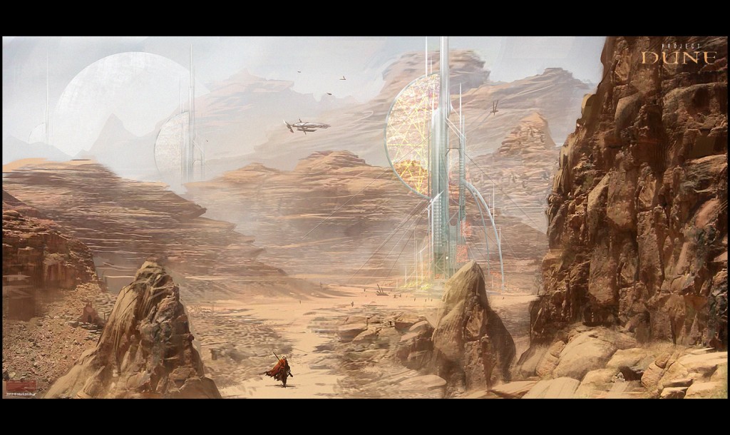
Frank Herbert opens the plot with the young Paul Atreides. Son of Duke Leto, at 15 he witnesses the emperor’s decision to give his house stewardship of Dune. This is part of a plot planned by both the emperor and the Baron Harkonnen, arch enemy of the Atreides and leader of the Harkonnens. On Arrakis, Paul encounters a world dominated by desert, where water is the most precious commodity of the native population, the Fremen. Fierce warriors, they offer shelter to Paul and his mother when House Atreides comes under attack from the Harkonnens. Influenced by melange and the fremen survival teachings, Paul becomes Muad’Dib, the fremen leader bent on revenge.

First published in 1965, Dune is the best selling Sci-Fi novel. Readers should prepare for an almost dizzying level of details and names (some of which will twist your tongue in a knot). Herbert’s vision, a society relying on the mental and physical abilities of individuals who can live for hundreds of years, is unique within the genre. He doesn’t shy away from making it necessary to know all of these traditions in order to understand the narrative. Even more, every chapter is preceded by fragments from imaginary publications that are part of the story’s universe. The former is complex enough that Dune comes with a map and an index of terms.

The mind of every character is open to interrogation. Paul Atreides is a hero in the making, the young boy who swears revenge to those who murdered his father. His mother, Jessica, needs to protect her son but also train him into a worthy leader. Thoughts, feelings and states of mind are described in detail and often precede dialogue.

The biggest challenge is Paul’s mind who, upon contact with melange, starts having visions of the future. But these are merely blurry images of obscure objects. Spirituality is something common in the novel and you’ll have to pay attention in order to understand the plot and actions of characters.

Dune concept art by Mark Molnar

In many ways, Dune is the novel that makes you mature. There have been five sequels and Brian Herbert expanded the “Duniverse” long after his father’s death. The plot abandons Paul’s innocence in favour of politics, religion and at times love. The young Atreides is confronted by the idea of leading a group of fanatics and becoming a desert-Jesus.

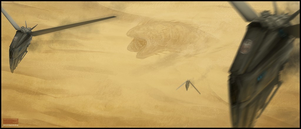
If all of this sounds interesting or if you’re simply excited by the idea of a world where you dodge giant sandworms and where the future is nothing more than a valley you can see from the top of a hill, the lookup Dune and step on the Arakian dessert.

Looking back to last couple of weeks

I refuse. Omitting aesthetics from journalism is a mistake.

Visualisation within reporting for a long time has been reduced to it’s absolute basic. Use a bar chart here, a line chart there and that’s about it; it’s accurate.

Now with the rise of the www. certain possibilities have risen so that even beginner fact-chasers can have a go at making something “pretty”:

With that in mind, I think that we’ve gone past the time when people look at charts and infographics just for facts.  Now there’s a new possible reaction: “This looks cool!”. I think that people want to be impressed by design as well. After all, despite the danger, a Corvette is still more fun than an Audi. Emotion is the surest way to get someone’s attention and journalists should use that venue. Even if the facts are there, it’s always worth going on the extra mile to make something a pleasure to look at.

Within the academic MA module that these later entries were part of, I’ve discovered that there is a very narrow and limited community for visualisation in journalism. I believe that is because there’s a wide gap between journos who just show the facts and designers who follow those steps towards visual Nirvana. There could be a market for people who have training as reporters but a keen interest in this. The author finds the idea very appealing.

Where to?

Having finished my assignment, expect longer pauses between posts. That’s still good, considering I had a single article for a few months.

I will go on to finish my map and I will try to be creative about the outcome. It won’t be enough just to see the locations but also to invite people in interacting with the map and discovering facts. This is not mentioning the stories that will be drawn from that.

I will also go more into code. I have been through introductions into several languages but the general lack of time has been an obstacle. With the Easter break coming, I should have time to get away from my primary tool into mark-up, the buggy Edge Animate. Code is genuinely easy to learn. It’s programming in general that’s the hardest. My opinion: because you can’t see it working.

Here’s how data visualisation works cross-platform

You can visualise anything.

80% of how we perceive life is through our eyes. So here are five platforms where people turn figures into facts.

Twitter: Andy Kirk


Andy Kirk is a UK-based freelance data visualisation specialist. He has delivered over 100 public and private training events across UK, Europe, North America, India, South Africa and Australia. Follow him and don’t forget to check out his book.

Instagram: Mediaplanningco

If you didn’t know, Instagram is bigger than Twitter. Media Planning Consultants take advantage of this by populating their stream with colourful but simple infographics in order to “establish a partnership with clients”.  Don’t forget that Instagram is also a way of gathering data, like finding out what photos say about your city.

YouTube: TED-Ed

Earlier I blogged about the importance of content in four dimensions. Nothing better than YouTube to show how this works. TED passionately believes that ideas have the power to change the world and TED-Ed has a commitment to creating lessons worth sharing. Their videos are a great combination of tutorials and presentations into data visualisation. And if you still can’t find what you’re looking for, it’s always a good idea to search for playlists.

Facebook: Infographics

Facebook may be mostly about talking to your mates but pages are are always going to make an impression. This one has very interesting designs.

And since we talked about videos, check out how this photo‘s shares were mapped:

Google+: Apandre

Google’s relatively young social media platform is growing and that’s good because images look stunning on it. Here’s an example of what visualisations looks like and here’s a community as well.

And finally…sound

You probably didn’t expect this. For people preferring to listen, here’s a presentation by Andrew TriceTechnical Evangelist from Adobe: …and one (where I attended) from Caroline Beavon talking about her work:

5 visualisations showing the extent of design in journalism

Visualising data or stories has more to do with creating visuals that resonate with the target audience rather than just bars and graphs.

People will quickly associate familiar elements with their own experiences. This way they are more likely to pay attention to your visuals and subsequent story. In addition, designers and journalists should not be afraid to represent their content in two, three or even four dimensions. Each one adds another layer of work to be done but the results are well worth.

With that in mind, here are 5 examples of visualisations done right.

The Ukrainian revolution through Instagram

Photo: The Everyday Project

One simple way to visualise is to collect visuals already in existence. User Generated Content is the obvious candidate here.

In this example, Instagram photos from during the protests in Kiev were scraped to illustrate what people were doing in that period. More than 13.000 images from 6.165 accounts were arranged into a collage ordered by date and time.

Together with a vertical timeline, this simple but effective technique revealed that in between the violent clashes, things were just as usual.

Mapping the American Whaling industry

This map, made by Princeton graduate Benjamin M. Schmidtshows what can be done when time is added as a factor in visualisation. Looking at how something changes over the years gives quite a different perspective. That and it’s also exciting to look at.

In the author’s own words:

“Data visualizations are like narratives: they suggest interpretations, but don’t require them. A good data visualization, in fact, lets you see things the interpreter might have missed.”

Measuring a black hole

Some things are pretty big. And “pretty big” doesn’t translate well into numbers. People need to see.

Such is the case with black holes, collapsed stars that have given birth to bodies which are both big and heavy. And this short animation shows just how big and heavy.

Note that the music plays an important role in setting the mood.

Sexperience 1000

Sexperience 1000 interface

…or “what the great British public get up to between the sheets”.

This complex project allows you to see the ins and outs of sex life. Interactivity is key here. You can answer in sections ranging from number of partners to cheating. You can see how others answered and which group you’re in.

Moreover, you can follow one or more individuals to see the trends they follow and which categories they fit into.

NoiseTube

Image: NoiseTube
Image: NoiseTube

Finally, here’s an example of how to take it offline for people to use.

This mobile app records the sound of your surrounding and sends it, along with your location, to a server which then compiles a map. This way several people can build maps of the loudest parts of their city. It’s much more detailed than government data. Here’s what people have mapped so far.

It’s a clear example that everything can be visualised, including sound.

How I cleaned data with OpenRefine

Many thanks to Paul Bradshaw in helping out with this.

Journalists rarely get their hands on nice and tidy data. Public bodies don’t have the interest of providing it structured. It’s a journalist’s job to arrange it before extracting patterns and stories.

In this spreadsheet, I’ll be taking you through how me an Paul cleaned data using OpenRefine.

Importing and preparing

The data I’ll be working with is a list of litter bin locations in Birmingham.

Our initial table
Our initial table

Problems:

  • blank cells
  • empty columns.
  • headers and page numbers repeating

Page numbers and headers appearing regularly and must be removed
Page numbers and headers appear regularly and must be removed

We want each pair of coordinates to have a location description that occupies a single row.

OpenRefine is specifically designed for problems like this. We import our file and we parse our first two rows as column headers. We then delete empty columns and rename the rest accordingly. In the end, our table looks like this:

Our table in OpenRefine is ready to be cleaned

Removing recurring headers

We should start removing header names that keep repeating.

Most obvious would be to find each ROAD_NAME string and delete it. However, it’s best practice to create a separate column with the cleaned data so that you can always return to the original in case of a mistake.

Left click on the drop down menu of Road name and Edit column>Add column based on this column… We will give our new column a new name and use an expression to replace ROAD_NAME with nothing:

value.replace("ROAD_NAME", "")

We do the same for Location, Ward and also remove the recurring POINT_X from the last column by applying the above expression in Edit column>Transform.

The table now has extra columns with the headers removed

Joining rows

Some of our cells have multiple rows and multiple values which we need to join. But first we need a reference, a column that has one row for each corresponding entry. In our case, it’s Point X or Y so we move one of them at the beginning

For each cleaned column we go to Edit cells>Join multi-valued cells… We’ll be asked for a delimiter, a character that marks the beginning of a new value, which in our case is a blank space; so just hit your space-bar.  After that we delete the old columns.

Now each entry occupies a single row

We’re almost done. As can be seen, empty rows remain where the old values were deleted. This is why we move Point X to the beginning. All we need to do is select Facet on Point X, Custom facets>Facet by blank. A Facet works much like a Pivot Table in Excel. We’re telling OpenRefine to display the value count of a column. In this case, I’ve asked for blank cells so a window in the left will display True of False. We can now select the True entries so we have all of Point X’s blank cells as well as the rows that go with them. All we need to do is select all (drop down from furthest left), Edit rows>Remove all matching rows.

Faceting the first column for blank cells

Oh no! All of your data has disappeared! That’s because OpenRefine is still displaying blank rows, of which there are none. Just close the facet window from the left and now you can see all of your data is nice and clean.

Our data is now ready to be interrogated

OpenRefine is a powerful tool for doing this sort of work and contrary to popular belief, one needn’t learn all of it. Just use what you know and look up what you don’t.

Something extra

The table looks good however some cells from Location still have the page numbers on them. If you want to take it further, you can get rid of these so that the addresses are completely clean.

To do this, we’ll have to use something called RegexWhat we want to delete has the form of Page [number] of 192. We can instruct OpenRefine to look for structures such as this because it is a regular expression (reg-ex). Regex allows the defining of strings that follow a given pattern. A list of commands is here.

So, we make a duplicate of our column where we apply Transform on it’s rows and we use the following formula:

value.replace(/\sPage\s\d\d?\d?\sof\s192/, "")

And here’s the explanation:

[edge_animation id=”7″]

The name of the game

Speed is the name of the game; at least with the Internet.

After keeping it devoid of posts for a few years, I started adding photos to my Instagram account. Besides being an excellent tool for any image-maker (I explained earlier), it also gave me an insight.

The web is saturated with information up to the point where people discard features for filtering. For instance, YouTube has extensive features for publishing and viewing videos but somehow Instagram seems more attractive.

15 seconds is more than enough to get a point across and people would probably ignore anything longer. Here’s an interesting example, not to mention the photos:

Shadow Play(with a little flip) #whpmovingshadows

A video posted by Eric Ward (@littlecoal) on

It’s simple and a pleasure to look at. I’d avoid the sound though.

P.S. I’ve decided to get back to blogging (I have done it before, you know) so expect more posts.

Strategies for using Instagram

Instagram can be a great tool for reaching a specific audience. You just have to adopt a different posting strategy.

Here’s some advice with pics to inspire you.

It’s all about the visual

Photo by @f_bene
Photo by @f_bene

Instagram wasn’t made  to share news in the same way as Twitter. People expect to see aesthetically pleasing images in their feeds. So find the visual angle to whatever it is that you’re working on and post it for others to see and enjoy. Remember that people like to emphasize with images.

Be creative

Photo by @vicenews
Photo by @vicenews

Even though the CEO of Instagram is a photographer, you don’t have to be one. Just remember that you can upload any image, not just photos taken with the app. This is a creative opportunity you can’t ignore. So don’t be afraid to fill that square with graphics, photos from other users and anything that makes your idea work.

Consistency is key

Photo by @gillian_zinser

Post images that are similar in the way they look. Try to develop a visual style that is yours. People will recognise you for it and will realise it’s your image before seeing your name. Look at how actress Gillian Zinser only posts soft-toned, desaturated images. It’s a trademark and people know her for it.

Don’t link

Photo by @places_birmingham

Don’t bother putting links in your posts. People can’t access them and they wouldn’t want anyway. This is why some think Instagram isn’t ready for news publishing. Instead, create a flow of visually-interesting content that relates to your work. This will get people to follow it and eventually click the website link on your profile description.

Enhance your accessibility

Photo by @ikongallery

Lastly, make sure you use Instagram in a simple manner. The desktop version doesn’t allow for much control but there are alternatives.

Collecto is a useful service that allows you to manage you account from your PC or Mac. It allows you to see popular users or sort them by location. It’s also good for finding apropiate hashtags.

Latergram is a scheduler for Instagram posts. Don’t post all images at once, instead find out which times of the day work best for you and schedule them for then. Presently you need an iOS device for it to work.

Iconosquare gives you the analytics. It allows you to easily see which posts got the most engagement over time. Another feature is that you can see the above for other users. So have a look at what strategies successful users employ.


Night photography part II

10 minutes ago, I just shot almost an entire roll of film on the moon.

Using the moon and nighttime calculator, I was able to catch the moon just as it was rising. Just as I hoped, the dynamic range between the moon and the ground was significantly less: about 3-4 stops. This should, in theory provide me with a usable image. PanF isn`t a particularly ranged film so I`ll repeat this shot tomorrow night with some HP5 pulled to ISO 200.

I made sure this time that I got everything in, I bracketed about 3 stops on each side. The meter alone read 2 seconds at f/2.8 and ISO 50 on the moon, which I think is complete rubbish.

The moon indeed is less bright at moonrise, is also has an orange cast, which would ruin color shots but for black and white it`s just perfect. What`s interesting is that moonrise is faster that you`d imagine, in 30 minutes, the scene was gone and the moon became too bright and moved too far up


Can`t wait to develop the film :X…