Color negative film is said to have this magic neutrality and consistent skin tones but where are they? Every time I send my negs to the lab I got all kinds of colors both in scans and in print. I almost got used to thinking of color negs as unpredictable but recently I’ve given them another try.
Why bother?
If you shoot film for “true to life colors” then read no further. Just buy an X-rite Passport and use your digital camera. Honestly, you’ll be much better off simply because there’s less room for error. Just shoot the color target under your conditions and then you get absolute, mathematically-perfect accuracy in print.
With film there’s processing, the scanner, scanning software, etc. You’ll be going in circles so much trying to get everything perfect that you’ll forget why you’re doing it.
All I’m trying to achieve here is a method to convert color negatives to positives in the same way. Consistency is what I’m after. As you know, color negative film has an orange mask designed to aid optical printing. It’s a problem because it affects every color layer differently so it’s not just about adding the opposite of orange to neutralize.
Kill that mask
First of all, it would be best if you did all of your processing and scanning yourself. I got the Tetenal C41 kit which is easy to use. I also bought a flatbed scanner. If you decide not to do this, at least try to use the same photo lab. The scan should be made as positive, no adjustments, TIFF/RAW and in 16 bit so we a lot of information to play with.
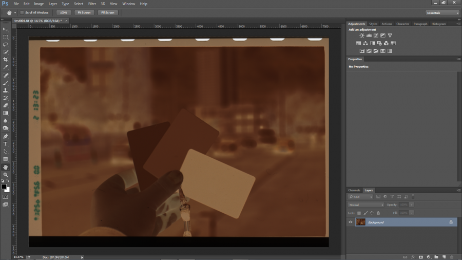
I shot a cheap grey card in full sunlight at midday on Kodak Portra 160. You can of course choose any frame in any light but for consistency it’s best that we start with something shot in sunlight which this particular film is balanced for. Now Ctrl/Cmd + I to invert it.

Straight off, the photo has a heavy cyan cast and is very flat. This is apparent on the Curves histogram so we have to trim the excess.

The trick is to do this for each color channel: Red, Green and Blue. Move the bottom sliders closer to the histogram but make sure you don’t clip anything. Tick Show Clipping to be sure.

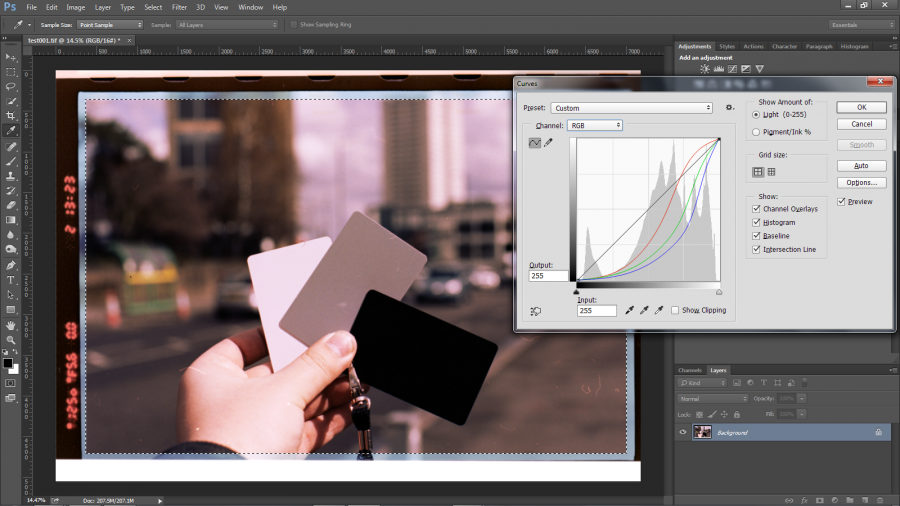
Our image has improved. There’s still a cyan cast but at least the contrast is ok. Save the curve for now and hit OK. I scanned a bit of the outside of the frame; I select just the photo so I get an accurate histogram. Open Curves again and load the one you just saved.

Our old curve obviously clips some of our data but we need it for something else: place 3 points on the curve of each channel for shadows, mids and highlights. Now pull the sliders back to their maximum positions.

If any data is still being clipped then adjust the shadow or highlight points left or right until the curve doesn’t clip anything. Do this for every channel.
Our image looks significantly better. Now the tricky part: adjust the individual channels to get the colors you want. Use the 3 points you created and move them left or right. Do it in small increments, switching between channels as often as necessary and making sure you don’t clip anything. You’ll only need to do this once.

The curve you just saved is the basis for your next photos. All you need to do is scan every neg as a positive, invert it, trim of the color channels, load this curve and adjust if necessary.
Getting consistency
Of course, that’s not the end of the story.
Films are all different so you should create a different curve setting for each. If you have a series shot under the same conditions then by all means pop in a grey card and you’ll have better consistency. I personally let the film look take over. For accurate results I use digital. Also, there’s no reason why you couldn’t use the same technique for slide film.
Also check out this article by Tristan Campbell for a more technical view. It served as a basis for mine but I felt it could be shortened for people who didn’t want to go into detail.
There are of course a lot of ways to handle this issue; this is what works for me, I hope it does for you too.